Higher education websites are notorious for overwhelming users with way too much information. Horizontal scrolling is a promising solution to this common problem.
Each higher education website is as distinct as the college or university it represents.
Yet if there is one thing they all have in common, it’s the large amount of content they need to share with the user all at the same time.
Admissions, athletics, spiritual life, academics, about, financial aid, campus life, social clubs – the list of departments, programs, and ways to get involved is endless!
This creates a huge challenge for web design.
Where do you put all the information?
The most common answer to that question has been: Put it all further down the page.
But infinite scrolling has its limitations.
Infinite scrolling has become a staple in higher education website design. Users simply keep scrolling down, usually with beautiful parallax effects and sweeping campus landscape pictures in the background.
And because most users are highly accustomed to scrolling through never-ending newsfeeds in their social media platforms, infinite scrolling works very well.
However, there is a problem with constant scrolling.
On the desktop layout of your site, you can fit a large amount of information onto the screen at one time. This means that users can scroll down through your homepage relatively quickly to see all the content.
But what happens when your website switches to the mobile layout?
The scrolling process gets longer and longer. Users have to flick their screens many more times to get to the same information they found on your desktop site.
By the nature of their design, mobile sites force users to scroll down much further to find the same information.
And if you make prospective students look too hard for the information they need, they’re likely to leave your site.
Studies have shown that nearly 79% of students would remove a college from their list of considerations if they couldn’t find the information that they were looking for.
That’s a really big deal.
So how do you fit all the information you have into your mobile site without forcing the user to dive forever down the page?
Horizontal Scrolling
While I can’t say it’s brand new to web design, horizontal scrolling has seen a definite rise in popularity on social media and media streaming services like Netflix.
In past years, horizontal scrolling has looked mainly like a photo slider.
Unfortunately, photo sliders and other kinds of horizontal navigation get a lot of complaints from web users, causing most web designers to avoid them.
But recently, horizontal scrolling has been coming into its own.
Facebook has had a lot of success with its horizontal scrolling Facebook Ads, Stories, and “People You May Know” prompts.

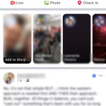

Each of these horizontal scrolling sections allows the user to scroll in a different direction to see more of that kind of information.
If you want to see more stories, scroll to the right. If you want more ads, scroll right.
Instead of making me scroll even farther down to see all of one type of information, I’m given the opportunity to scroll horizontally. But if I don’t want to see more of it, I just keep scrolling down.
While this user design element isn’t as useful in the desktop layout, it really shines on mobile sites.
So how can you leverage horizontal scrolling to stand out and give your users a web experience they’ll love?
Display Multiple Stories with Horizontal Scrolling
One of the first ways colleges and universities can use horizontal scrolling is to feature student, faculty, donor, and alumni stories.
Instead of scrolling down endlessly through a bunch of stories or quotes, consider creating a horizontal scrolling section of these personal testimonies of your education brand.
Prospective students and even their parents are very used to this kind of scrolling when browsing through stories on their social media platforms.
Show a Variety of Programs with Horizontal Scrolling
You can also use horizontal scrolling to let users browse through a large catalogue of academic programs, sports, or performing arts.
Design it so that users scroll vertically between the major categories like athletics, campus life, science, business, education, etc.
And then the user can scroll horizontally to go through the various programs within that category.
This breaks up the monotony of flicking down a hundred times as the user looks for the program they’re really interested in. And it keeps your pages at a reasonable length.
Offer Campus Maps
Maps don’t normally fit well on web pages. Users also want to interact with them.
They want to zoom in and out, and scroll horizontally as well as vertically as they explore where your campus is located compared to where they live.
Most embedded maps already feature horizontal scrolling by default, so you don’t have to worry too much about implementing this one.
Entice Users with Related Content
Have you ever browsed through Amazon looking for one thing, but then ended up buying two other things you weren’t planning on?
This happens to me most often through their “Related Items” horizontal scrolling feeds.
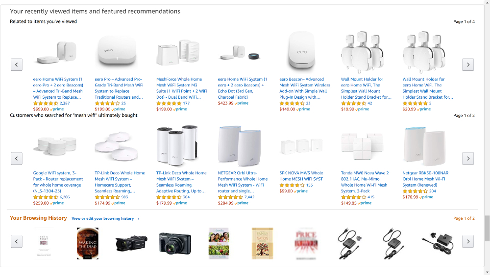
In the same way, you can use horizontal scrolling to entice prospective students to check out blog posts, white papers, and other content you’ve published without cluttering up your page.
Consider Horizontal Scrolling for Your Website
There are some traps to avoid in using horizontal scrolling for your higher education website.
Keep in mind that you should never include primary information in a horizontal scrolling section. If it’s information your prospective student must see, include it in sections they will see as they scroll vertically.
Don’t hide primary information in a horizontal list!
Horizontal scrolling is best suited for secondary information that’s meant to offer the user more details, options, or related content.
Also, make sure that the user can see a small part of the next element in the horizontal scroll.
If they can’t see what’s coming, they’re likely to scroll down and skip the section all together. No one wants to waste their time browsing an unknown series of content.
If you avoid these potential trouble spots, horizontal scrolling can be a perfect solution for information overload on your education website.
Click here to read this article on the Caylor Solutions website.